Friday, 28 October 2011

Colour!

Colour affects how we view a brand, company or product. Different colours have different connotations; red is passion, danger, and romance; purple is mysterious, royal and sophisticated etc. Companies have to choose very carefully what colours they use to brand themselves so that they give of the right image. But what happens when famous logos are edited, so that the colours are different?
Barbie is clearly aimed towards young girls, which is why the colour of the logo is pink. I've changed it to the colour blue, which is seen as a "boy colour". Just changing the colour to blue has made it look less "girly" and more ambiguous. This is exactly what Barbie (as a company) does not want. It's too confusing and doesn't make it obvious who the target audience is.
Barbie has a specific audience to market to, which makes it easier to choose colours. But what if there isn't any clear target audience? For example, Facebook, this is used by millions of different people from different backgrounds and cultures.

  
Click for larger image
To be honest, changing Facebook to green hasn't really done much. It does look more 'earthy' and fresh. However, green like blue is quite a neutral colour.

I've made a few other colour changes to famous logos. Click for larger images.


Thursday, 13 October 2011

Week one, Task one...


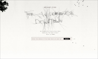
The wilderness downtown is a website created in HTML5 and showcases an original way of viewing video.  The website asks for your postcode and combines Google Maps , a music video and interactive applications in different windows to create an overall multimedia experience.  The website is very engaging to the user as it is, to my knowledge, is the first website to combine Google Maps and video in a HTML5 format.


Nike better world is a website that shows everyone how Nike and sport is made to make a better world. Using examples such as how well Nike recycle their products (Even the advert at the start of the website is using 100% recycled ads to illustrate their point.).
What makes the website stand out is how HTML5 is used. It uses a very innovative scroll system which adds a lot of depth to the website making it feel more dynamic and fluid. The website also intergrates the new way of adding videos to websites using HTML5. There is no real reason for people to come back to the website, however, there is a wealth of information which is presented well which may cause the user to come back.


Rupetroll combines HTML5, CSS3 and Javascript to create this extremely minimalistic and simple game. You are a little sperm thing that you can control with your arrow keys and/or mouse. You swim around the universe and talk to other people in this massive multiplayer. It also intergrates twitter so that you can use your Twitter account and meet new people. It’s a modern day chatroom. One huge problem with this idea is that it may be too simple. There is no real reason for anyone to come back, and this is evident as last time I checked, then entire game was empty. This makes the whole thing redundant. However, it’s an interesting idea, and just shows what HTML5 and CSS3 can do.