
Friday, 20 January 2012

Friday, 28 October 2011
Colour!
Colour affects how we view a brand, company or product. Different colours have different connotations; red is passion, danger, and romance; purple is mysterious, royal and sophisticated etc. Companies have to choose very carefully what colours they use to brand themselves so that they give of the right image. But what happens when famous logos are edited, so that the colours are different?


Barbie is clearly aimed towards young girls, which is why the colour of the logo is pink. I've changed it to the colour blue, which is seen as a "boy colour". Just changing the colour to blue has made it look less "girly" and more ambiguous. This is exactly what Barbie (as a company) does not want. It's too confusing and doesn't make it obvious who the target audience is.
Barbie has a specific audience to market to, which makes it easier to choose colours. But what if there isn't any clear target audience? For example, Facebook, this is used by millions of different people from different backgrounds and cultures.

Click for larger image
To be honest, changing Facebook to green hasn't really done much. It does look more 'earthy' and fresh. However, green like blue is quite a neutral colour.
I've made a few other colour changes to famous logos. Click for larger images.


Thursday, 13 October 2011
Week one, Task one...
 The wilderness downtown is a website created in HTML5 and showcases an original way of viewing video. The website asks for your postcode and combines Google Maps , a music video and interactive applications in different windows to create an overall multimedia experience. The website is very engaging to the user as it is, to my knowledge, is the first website to combine Google Maps and video in a HTML5 format.

Nike better world is a website that shows everyone how Nike and sport is made to make a better world. Using examples such as how well Nike recycle their products (Even the advert at the start of the website is using 100% recycled ads to illustrate their point.).
What makes the website stand out is how HTML5 is used. It uses a very innovative scroll system which adds a lot of depth to the website making it feel more dynamic and fluid. The website also intergrates the new way of adding videos to websites using HTML5. There is no real reason for people to come back to the website, however, there is a wealth of information which is presented well which may cause the user to come back.
What makes the website stand out is how HTML5 is used. It uses a very innovative scroll system which adds a lot of depth to the website making it feel more dynamic and fluid. The website also intergrates the new way of adding videos to websites using HTML5. There is no real reason for people to come back to the website, however, there is a wealth of information which is presented well which may cause the user to come back.

Rupetroll combines HTML5, CSS3 and Javascript to create this extremely minimalistic and simple game. You are a little sperm thing that you can control with your arrow keys and/or mouse. You swim around the universe and talk to other people in this massive multiplayer. It also intergrates twitter so that you can use your Twitter account and meet new people. It’s a modern day chatroom. One huge problem with this idea is that it may be too simple. There is no real reason for anyone to come back, and this is evident as last time I checked, then entire game was empty. This makes the whole thing redundant. However, it’s an interesting idea, and just shows what HTML5 and CSS3 can do.
Thursday, 24 March 2011
Web - Digital Me - Mood Board
We were ask to make a mood board full of images that describe our personalities. Here is mine
 (click for full sized)
I've grouped different hobbies and things together. The majority of the mood board is martial arts based. I am a huge martial arts fan so I've added pictures of organisations/events I like plus my favorite fighters, Remy Bonjasky and Bruce Lee. I also threw in a picture of myself copying my hero Remy roundhouse kicking a dude in the face.
The bottom of the mood board is a combination of Comedy and Music. Two of my other passions. I've got a picture of Joe Rogan and Richard Pryor. I chose these two because they are funny AND fight fans. I'm also in a comedy music duo, which is why I grouped the two together.
The other group consists of cartoons I love. Mostly from the 90s era, as that is when cartoons were at there best, and if you disagree then you are wrong.
There is also a picture of san-serif fonts. That's there just because I like san-serif fonts.
Friday, 18 March 2011
Moving Image - Self Evaluation
We were giving 5 weeks to create a 3 minute film from a script we were given from Jools called ‘Ticket’. It was written like a romantic comedy, however it was a bit disjointed and hard to understand.
My role in the group was camera man. This meant I had to work with the director (Parastoo) all the time to make sure that every shot was how it was intended. Communication was essential for the film to look decent. I believe I worked well with Parastoo and every shot was filmed as planned.
Our group started working very early on and didn’t waste any time getting things sorted. Our producer (Katie) did a great job of securing our locations and left plenty of contingency time in case shooting on the bus was not possible. I feel that our group did a very good job of planning and keeping organised. We would meet up at least two times a week outside of seminars/lectures to keep each other updated on our progress and to discuss further ideas. Without this planning, I feel that our film would have looked messy and unprofessional.
There were a few hitches along the way however. As I was camera man, I had to really know how to use the camera so I could get the most out of it. I’ve never used a professional camera before, so I had to learn as I went along. Before the filming day, I researched on the different functions of the camera (e.g. how to adjust the iris, aperture etc.) I feel like I did a decent job on the day, considering my lack of experience.
Another problem our group faced was we had too many ideas. During the meet ups, we would all throw out a bunch of different storylines and character designs which resulted in confusion amongst the group. This means a lot of time at the start of the project was wasted as nothing really came to fruition. I feel in order to get over that problem we need a more structured meeting. Instead of just throwing out ideas we think of on the spot, we should have went away to think about it, and bring to the group there favourite ideas. Then we can pick different ideas from people to make a solid storyline. This would mean the whole process would be less confusing and stressful.
Another problem our group faced was we had too many ideas. During the meet ups, we would all throw out a bunch of different storylines and character designs which resulted in confusion amongst the group. This means a lot of time at the start of the project was wasted as nothing really came to fruition. I feel in order to get over that problem we need a more structured meeting. Instead of just throwing out ideas we think of on the spot, we should have went away to think about it, and bring to the group there favourite ideas. Then we can pick different ideas from people to make a solid storyline. This would mean the whole process would be less confusing and stressful.
There isn’t too much that I would like to change if I were to do this project again. I feel with the time we had, and the experience we had, we did a pretty good job. There are some small things that I would do differently however. I felt like we were being over ambitious with the green screen, as it’s very hard to make it look right in post-production. I would also like to see if we could film with a moving bus to see what that would have been like, but that may have caused a few more problems and been a little more time consuming. Overall, I am happy with the finished product.
Group edit of 'Ticket'
Title for Ticket
In my spare time I decided to play around with Adobe After Effect and try and teach myself some things. I was asked to make a quick title sequence for our film, and I wanted to make it as damn flashy as I could.
I would have made it a lot longer, but my computer decided to be annoying and keep crashing. However, I'm pretty happy with the outcome.
It's a shame that it never ended up in the group edit. So I'm gonna try and put it to use on my individual edit.
I would have made it a lot longer, but my computer decided to be annoying and keep crashing. However, I'm pretty happy with the outcome.
It's a shame that it never ended up in the group edit. So I'm gonna try and put it to use on my individual edit.
Thursday, 10 March 2011
Film - 3 Point Lighting
Friday's session was a very practial lesson. We went over the basics of lighting again, learning '3 point lighting'. Obviously this consists of three different lights. The Key light, which is the main light to light the subject. The fill light, which is used to fill in shadows of the face. And the back light. This light is used to create a rim-light around the subject to seperate them from the background. The 3 point lighting system is used mostly for lighting just one person, in an interview of news report for example.
This is what we ended up with. It isn't perfect because we didn't have enough time to adjust the lights around, so we just worked with what we had.
This is what we ended up with. It isn't perfect because we didn't have enough time to adjust the lights around, so we just worked with what we had.
Film - Ticket - Character Design
Our editor, Frazer, has written a very good description of what the characters, Lisa and Sam, will be like.
http://frazerbeattie.blogspot.com/2011/02/lisa-sam.html
http://frazerbeattie.blogspot.com/2011/02/lisa-sam.html
Film - Ticket - Week One
We were put into groups straight away and were given a script. Ours was called 'Ticket'. The story sounds like a romantic comedy; a quirky love story between two socially awkward characters. The script itself was hard to break down, it seemed very disjointed. This meant we had to be creative and find ways to make sense of it. A lot of ideas were thrown around in our group discussion. We all agreed we didn't want it to be a romantic comedy and we wanted a bit of a dark twist to the script.
In friday's sessions, we assigned everyone in the group with different roles.
Producer - Katie
Editor - Frazer
Director - Parastoo
Lighting - Olli
Camera - Me
Sound - MG
In friday's sessions, we assigned everyone in the group with different roles.
Producer - Katie
Editor - Frazer
Director - Parastoo
Lighting - Olli
Camera - Me
Sound - MG
Tuesday, 7 December 2010
3D Animation - Take Two!
Design Practice 1 - Animation take 2 - Graeme Nye from Graeme Kickass on Vimeo.
Ok, so I was being lazy before! I felt that a nine second video just won't cut it, so I made it longer and fixed a few things.
In the first video, you can actually see the word "Gray" fly across the screen during the first camera pan, I only noticed once I uploaded, and that just had to go. Secondly, when the objects start falling, I decided to space it out a bit for two reasons; it would extend the animation more; the sound effects won't get as muddled together.
Obviously I added more to the end, I feel that it looked quite spiffy.
Comments would be lovely :)
Sunday, 5 December 2010
Animation
Design Practice 1 - 3D Animation - Graeme Nye from Graeme Kickass on Vimeo.
Hmm, animation... Definitely the hardest of the 3 Design Practice tasks.
For the past three weeks we have been taught the very basics of 3DsMax which just include the basic interface, how to make things move (obviously) and the basics of modelling a character.
While I found animation to be the most interesting aspect of the Multimedia course so far, it was by far the most complicated of the three. This is mainly due to the fact that 3DsMax is such a huge piece of software, it's nearly impossible to learn it in just 3 weeks. So I had to experiment and discover features mostly by myself. A lot of time was also spent looking at online video tutorials, which helped, but for the most part just seemed to advanced or just not very helpful for what I needed.
In the second week of the module, we were taught how to make a funny little character called Jellyhead. This lesson was very helpful; and while the character 'JellyHead' looked very cool, I didn't want to copy it for my Ident. So instead, I took a lot of what I was taught, and tried creating a different character.
There isn't much I would do differently if I were to do this task again. I think the main thing holding me back was my inexperience with the software; most my time was stressing out trying to find out why things weren't working instead of actually animating. So all I need to do differently now is to just practice.
Please give any feedback you can if you're actually reading this :)
Friday, 3 December 2010
Interactive Space
We were given 3 weeks to create some kind of story. But instead of your usual linear story, we had to make it interactive and let the user make decisions which could affect the outcome.
In order for the interactive part of the project to work, we were taught the basics of HTML. Luckily for me, I was already quite competent with HTML and CSS so that could lead me to focus on the other parts. Such as story, and the picture quality.
The whole project was created in Adobe Dreamweaver CS4, and the pictures needed to be edited and compressed in Adobe Photoshop CS4. Again, I have already had a lot of experience using both these software, so it wasn't too difficult to get things done.
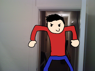
I didn't come across too many problems along the way, the task was quite simple. The hardest part was coming up with an original story, which would stand out from the rest. I decided to use a character I made a few years ago from an animation I created (Socially Awkward Alan. You can see the cartoon once you have finished the game!). I thought it would be a bit different and quirky if I could add someone/thing from the 'cartoon world' and put them in our own. Now that I had one concept sorted, I needed to actually think of a story. I finally ended up creating a slasher/horror story, but with a twist. I wanted to add some comedy to the project, so I made Alan the slasher, and when he catches you, he kicks you in the groin; the whole point of the story is to avoid the groin shot, and to somehow kill him.
There were a few things I would definitely change if I were to do this project again. I would make sure to use a better quality camera. I ended up using a camera phone, for no better reason other than the fact I was being lazy. I didn't want to have to walk through the cold to get a camera, and have to walk all the way back to Waverley.
Here are a few screenshots of my work, be sure to check out the full game at http://www.makingnewmaps.com and click on my wonderful face.
**SPOILER ALERT**

 Click for larger images.
In order for the interactive part of the project to work, we were taught the basics of HTML. Luckily for me, I was already quite competent with HTML and CSS so that could lead me to focus on the other parts. Such as story, and the picture quality.
The whole project was created in Adobe Dreamweaver CS4, and the pictures needed to be edited and compressed in Adobe Photoshop CS4. Again, I have already had a lot of experience using both these software, so it wasn't too difficult to get things done.
I didn't come across too many problems along the way, the task was quite simple. The hardest part was coming up with an original story, which would stand out from the rest. I decided to use a character I made a few years ago from an animation I created (Socially Awkward Alan. You can see the cartoon once you have finished the game!). I thought it would be a bit different and quirky if I could add someone/thing from the 'cartoon world' and put them in our own. Now that I had one concept sorted, I needed to actually think of a story. I finally ended up creating a slasher/horror story, but with a twist. I wanted to add some comedy to the project, so I made Alan the slasher, and when he catches you, he kicks you in the groin; the whole point of the story is to avoid the groin shot, and to somehow kill him.
There were a few things I would definitely change if I were to do this project again. I would make sure to use a better quality camera. I ended up using a camera phone, for no better reason other than the fact I was being lazy. I didn't want to have to walk through the cold to get a camera, and have to walk all the way back to Waverley.
Here are a few screenshots of my work, be sure to check out the full game at http://www.makingnewmaps.com and click on my wonderful face.
**SPOILER ALERT**


Tuesday, 16 November 2010
3DsMax
Just finshed my first seminar on Animation, and I have to say, it's pretty fun. I knew coming into the Multimedia course I'd probably have the most fun with animation, and I wasn't wrong.
Jelly from Graeme Kickass on Vimeo.
We were asked to make some text act like Jelly, and this is what I made. It was suprisingly easy to use, and a hell of a lot simpler than the frame-by-frame animation I would usually do on Adobe Flash.
Jelly from Graeme Kickass on Vimeo.
We were asked to make some text act like Jelly, and this is what I made. It was suprisingly easy to use, and a hell of a lot simpler than the frame-by-frame animation I would usually do on Adobe Flash.
Thursday, 28 October 2010
5 picture story
We were told to create a story in just 5 pictures.
This is what I came up with. It's a tale of adventure, romance and revenge. Starring me, and socially awkward Alan. Enjoy!


This is what I came up with. It's a tale of adventure, romance and revenge. Starring me, and socially awkward Alan. Enjoy!


Subscribe to:
Posts (Atom)